Here, is my evaluation:
http://emily-louise2010.wix.com/unknown-evaluation
Emily Smith A2 Media Studies Blog 2015
Wednesday, 1 April 2015
Thursday, 12 March 2015
My Brief 2: Teaser trailer, magazine cover, and film posters
For Brief 2, I chose to do; a teaser trailer, a magazine cover, and a film poster:
Unknown from Emily Smith on Vimeo.
Above, is my teaser trailer, and below is my magazine cover and my two film posters.
 |
| My magazine cover |
.jpg) |
| My bus stop poster |
Production: Showing my ancillary products to my target audience
The feedback for these products are from the same member of my target audience as the teaser trailer feedback, Danny hasn't ever seen any of the three products before, and has promised to give back non-biased feedback, I believe this as he studies Film Studies himself and therefore knows what he's looking for, and will not be afraid to give criticism.
Magazine cover
Magazine cover
Comments from Danny:
- The background of the magazine cover made it more identifiable from the film and also helped to link it, as well as this it gave him another insight into the genre, but also does not distract from the actors.
- He was happy to see a link between the magazine cover and one of the film posters, by mentioning on the cover that the main film poster features inside the magazine.
- The choice of words that feature in the middle of the magazine cover, are engaging and luring.
- It seemed very professional to him.
- And, follows the conventions of 'Empire' magazines that he has seen, and he has had to look at a lot of 'Empire' magazines himself, as he studies Film Studies at his own college.
Bus stop poster
- The black background draws focus towards the mystery woman in the centre of the the poster, enigma
- The quote that also features in the teaser trailer links the products together, but also helps to add mystery and brings up questions.
- Featuring 5 stars on the poster, informs him that the film must be of high quality and have good potential, making him feel that it must be worth the watch.
- Having a '#' is appropriate for him as he is 18 and uses social networking sites such as Twitter and Instagram frequently which are sites that use '#' and he can use this to find out more about the film or to talk to other members of the audience about it, interactive.
- It is simple, there's not too much happening in the poster that he doesn't know what to look at and it confuses him, because he knows what the focus is and what the production wants him to look at.
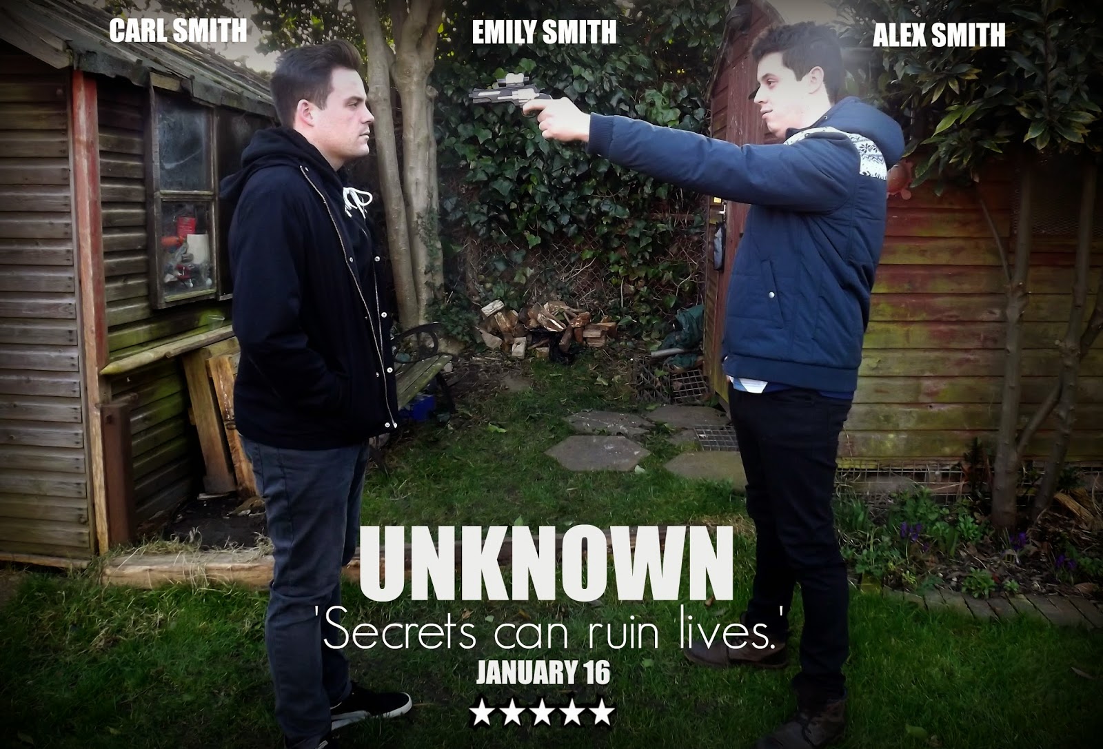
Billboard/magazine poster
- I have the a rough release date feature on it of when it comes out which makes it more informative, which is appropriate as it is the main film poster out of the two.
- He liked that both posters share the same quote, links them together and also both to the teaser trailer.
- This was his favourite out of the two film posters, which is another positive point as this is the main film poster, meaning that there will be more of these than the bus stop one.
- It looks very professional.
- The gun helps to identify the genre again, and also links to the teaser trailer as the gun features in that as well, also more appealing to the target audience if they enjoy this genre.
- He liked the background as this is also seen in the teaser trailer, again linking and identifiable, as well as it being an unknown place which links it to the title.
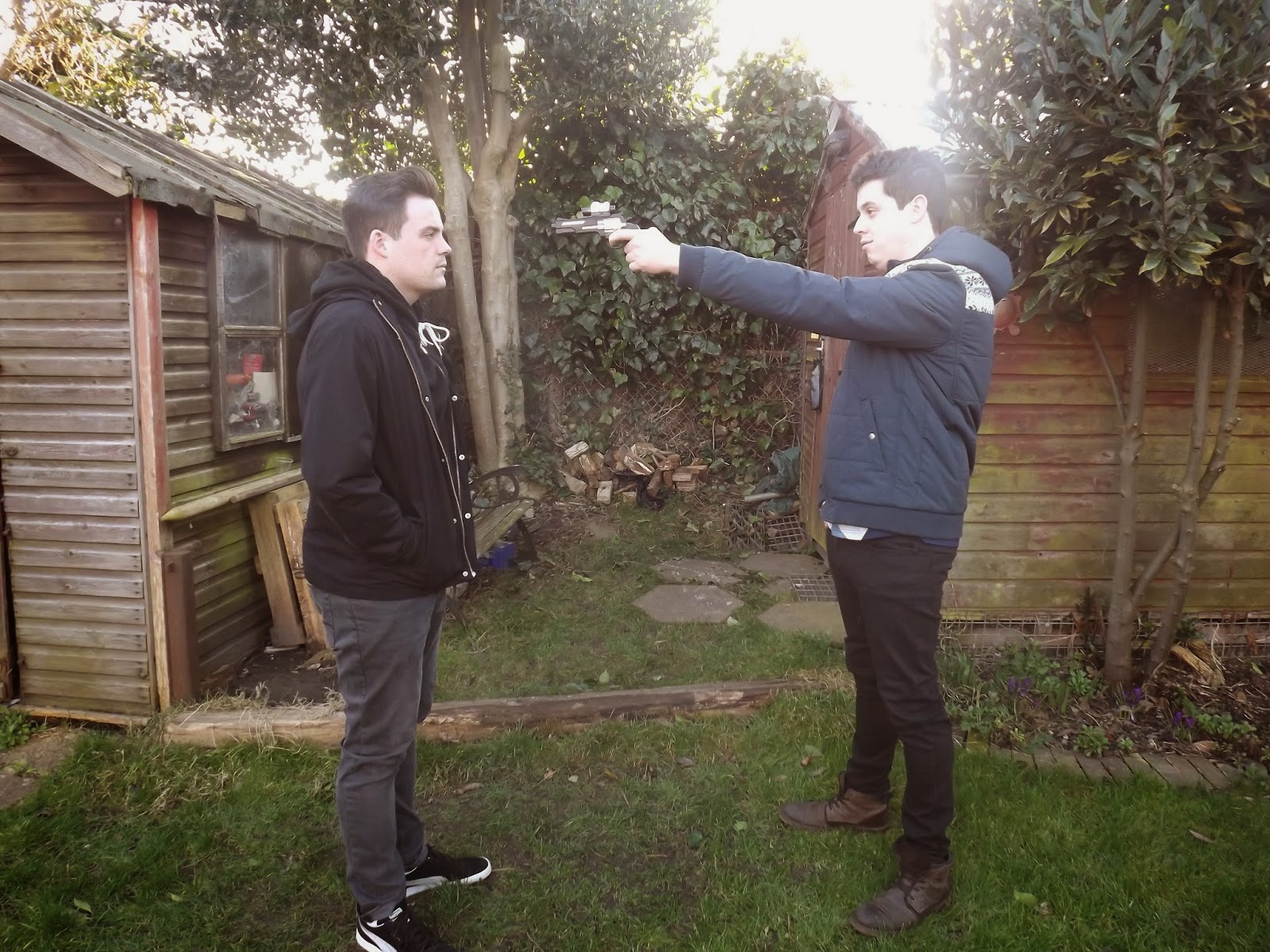
- The body language of the actors, makes it seem as if Alex (the one holding the gun) is afraid and unsure as to whether to go through with it, and that the other brother Carl believes that he would never do it, and this is a good thing as this is actually how the characters are feeling as you also see in the teaser trailer, as Alex is only doing this because he is scared as he does not know who to trust anymore.
Production: Showing my teaser trailer to my target audience
This is my final piece of feedback and it is coming from a member that is exactly what my target audience would be; Danny is 18 which is within the 15-30 range of my target audience, and he is also male again within my target audience, he also falls into the 'Impressionable Socialite' brackets, as he only views films that he feels he would enjoy based on their advertisement and also, only goes to the cinema as a socialising event or for fun.
For my teaser trailer, I received all positive opinions from Danny:
 |
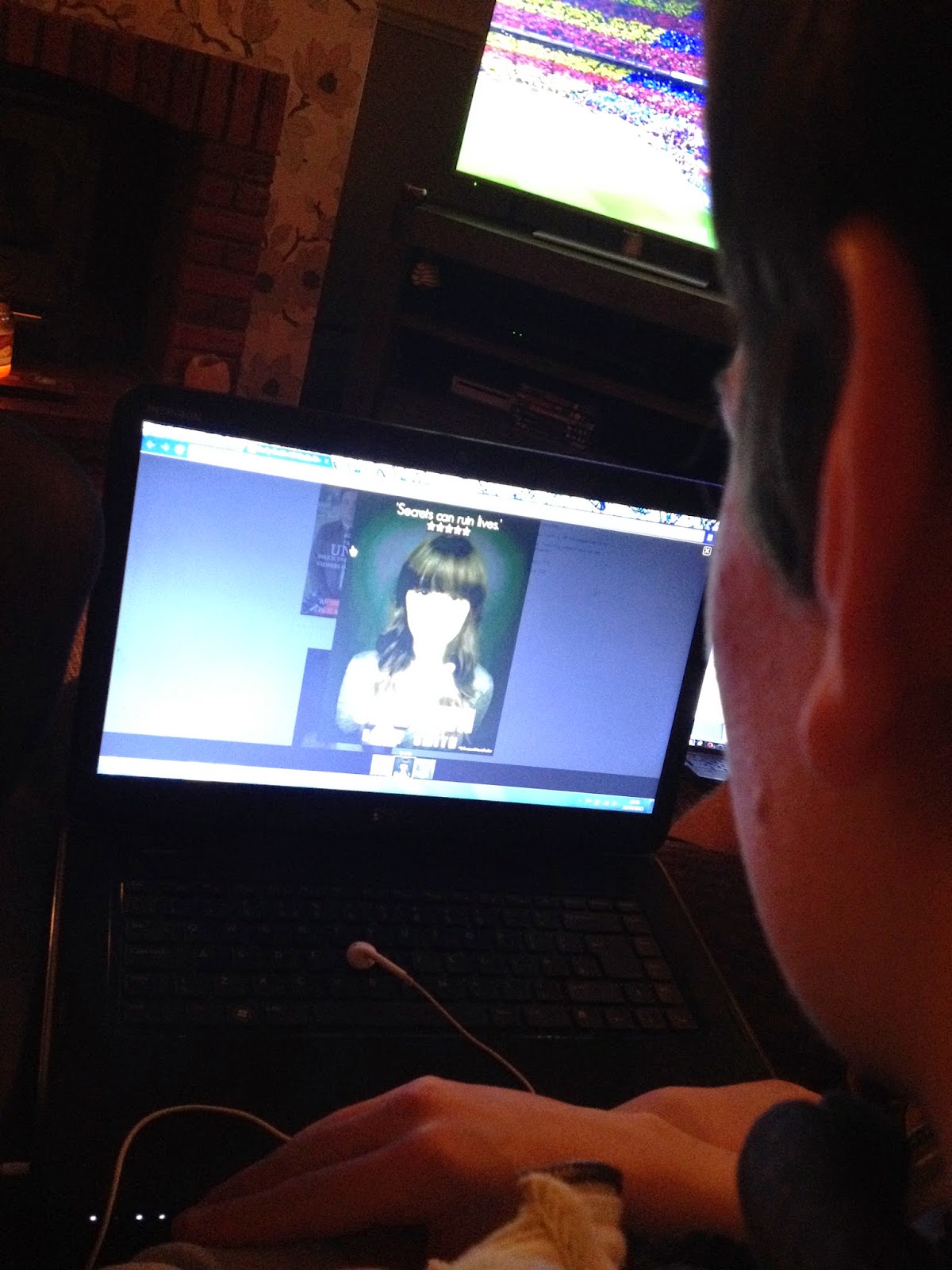
| My target audience (Danny) watching the teaser trailer for the first time. |
- He found that the music helped to set the scene and the mood of the teaser trailer and this created anticipation for him while watching it.
- It was intriguing with all the different cliffhangers, leaving him with lots of questions that he wanted answers to, and also plenty of mystery (enigma).
- He was happy to see guns and death involved in the teaser trailer, as he was able to identify the genre of the film because of this, clarifying that this is the correct genre for him and one that he likes to view.
Wednesday, 11 March 2015
Editing: Adding hashtags to my posters
I have added the hashtag "#UnknownMovieTrailer" to both of my posters (on the bottom right hand corner of my bus stop poster, and right at the bottom centre of my billboard/magazine poster). This will help to make my posters and teaser trailer more interactive with for my audience.
Tuesday, 10 March 2015
Editing: Finishing off my magazine cover
 |
| Adding in Carl |
 |
| Adding the final bit of text |
Editing: Creating my second poster
 |
| Before |
 |
| After |
For this poster, not only will it feature on the billboards as it is landscape with the two hero's on the front, but on the front of my magazine cover I am also going to have a piece of text mentioning that there is a poster inside the film magazine of my film 'Unknown' and it will be this poster, again linking my two ancillary products together.
Subscribe to:
Comments (Atom)

.jpg)


