Showing posts with label editing. Show all posts

Wednesday, 11 March 2015

Editing: Adding hashtags to my posters


I have added the hashtag "#UnknownMovieTrailer" to both of my posters (on the bottom right hand corner of my bus stop poster, and right at the bottom centre of my billboard/magazine poster). This will help to make my posters and teaser trailer more interactive with for my audience.

Tuesday, 10 March 2015

Editing: Finishing off my magazine cover

Adding in Carl

Adding the final bit of text
The final touches that I had to add to magazine cover was the picture I took of Carl from the same angle, distance and position that I took of Alex, once I had done this then all I had to do was erase the background that was behind him in the original photo. After this, my final touch was to add the banner of text at the bottom of the magazine cover about the 'Unknown' poster that features inside the magazine, which is also the same poster that I made that will feature on billboards, this is me linking my ancillary products together. And also I added the text that appears on top of the boys about the main article of the 'Empire' magazine, a common convention that you will see on all of the 'Empire' magazine.
Below, is my finished edit of the magazine cover:

My magazine cover

Editing: Creating my second poster

Before

After
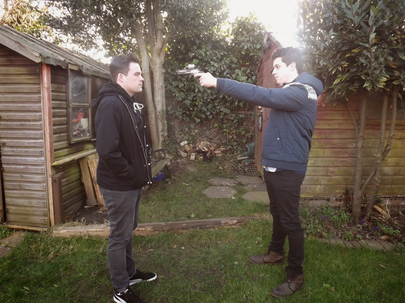
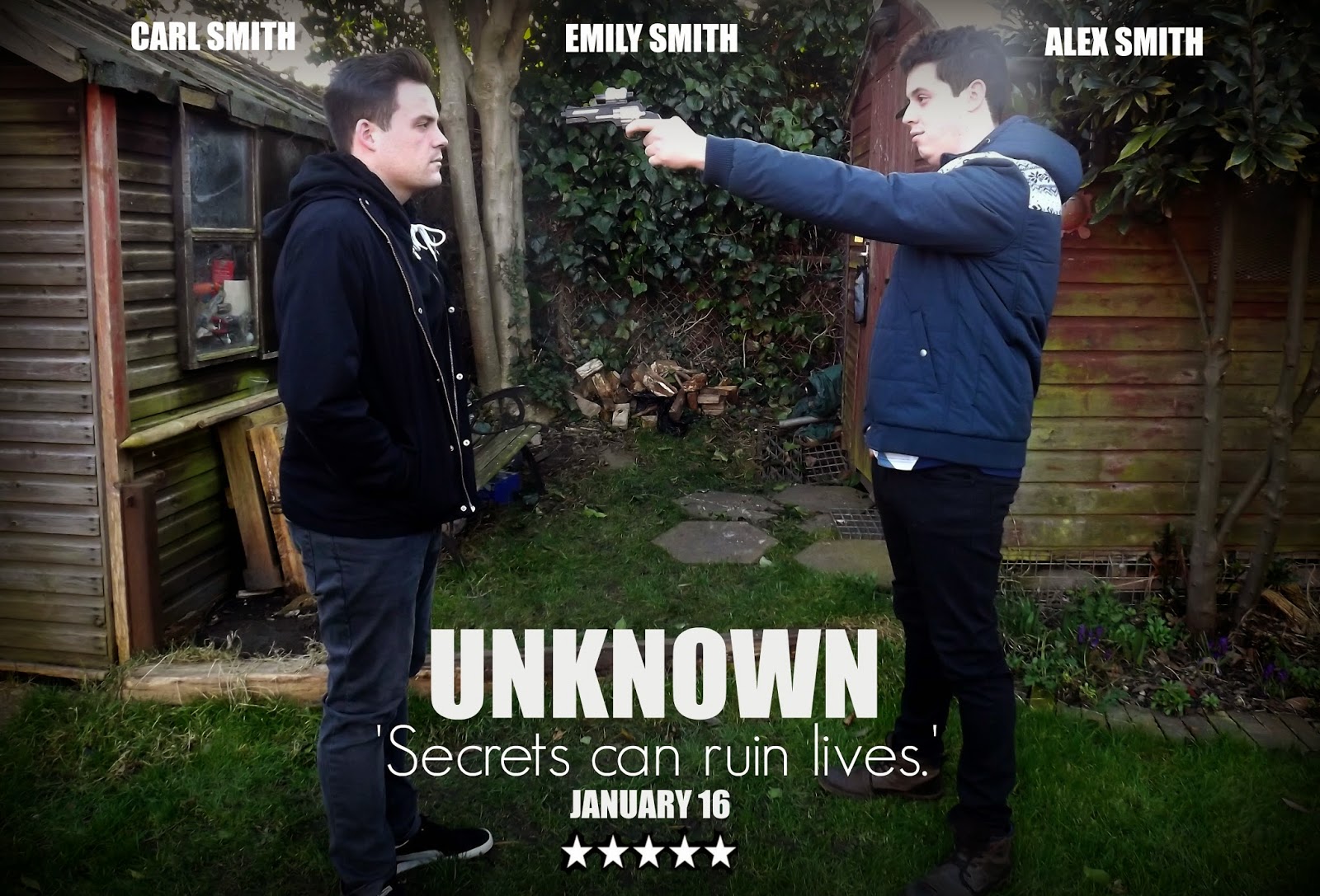
This photo was taken from one of the clips that feature in the teaser trailer, however I staged it again and chose to take it from a different angle, so that the two main character's were both equal in the photo and both the main focus, and this was also created on PicMonkey. There was a lot of work to be done to this photo before it was exactly how I wanted it. First of all, I cropped the picture slightly to make the boys more of the attraction and eye-catching feature on the poster, then I needed to 'Sharpen' the focus of the picture, and also make it darker as it is a dark scene that has been photographed; to do this, again I used the 'Dark Edges' effect, to draw in the focus on the characters, and then I used the 'Black and White' effect and faded it quite a lot until it was to the point of where I wanted it. After this I chose to star adding the text to the poster, and again I used the same, simple texts that I used for my other portrait picture, also using the quote from the teaser trailer again as this would link the two posters together, as well as linking them both to the teaser trailer; also adding the quote to both posters adds enigma, making the audience question what the secret is. In this one however, I chose to add the date that the film comes out on, and the name of all three main actors that feature in the film, as this is a larger poster that will feature in more places.

For this poster, not only will it feature on the billboards as it is landscape with the two hero's on the front, but on the front of my magazine cover I am also going to have a piece of text mentioning that there is a poster inside the film magazine of my film 'Unknown' and it will be this poster, again linking my two ancillary products together.

Editing: Getting one of my posters done

Before
After


I created this on PicMonkey. Here is the development of my film poster from start to finish. As I play the villain in the film, then I decided to have a black background, and once I started editing the picture the first thing I done was change the brightness on the picture and make it darker, I feel this would reflect the dark side of my character. And then, to make the darkness of my character blend into the background of the picture I used the 'Darker Edges' effect to bring the edges in together an towards my  portrait, almost creating this sort of black fog around me that I blended into. After this, I noticed how yellow my face and hand looked which looked slightly out of place against such a dark background, therefore I added the 'Black and White' effect over top as well, but faded it out a bit so that my face was whiter and more of a normal, natural colour. Now, I just needed to add text over top as there was nothing I needed to crop out of the picture, I chose pretty simple fonts so that they would not take away too much of the attention from the main picture, and white was just a colour that would be clear to read and matched well with the overall look.

I have made this poster because from the answers I got from my survey for my ancillary products said that the most likely places that my target audience would see my film posters would be on bustops and billboards, well these are two completely different places and one poster would not fit on both, therefore I took this portrait picture to go on the bus stops, also I feel that having me in the teaser poster will create a sort of enigma as the audience do not see me in the teaser trailer much and therefore creates a mystery, which is a key convention for thrillers, thus making the audience want to go and watch the film in the cinema.

Saturday, 7 March 2015

Editing: Adding articles to my magazine cover


Now, I have decided to add articles that link to the main feature on the front of the magazine, so for example my teaser trailer is of the Thriller genre, and I have added an article about all the top thriller films from 2015 (I still have one more to add to this yet), I have decided to make them link to the main feature as after I done some research into magazine covers, one of the main things that I discovered was that the majority of the smaller articles linked to the main one.
Also, another feature that I'm going to include on the front of the magazine that will link to the main production and my other ancillary product (film poster) is I'm going to have a piece of text saying that there is a poster in side on a certain page of my film 'Unknown' and it is going to be the same as one of the posters that I am going to make.

Update


I have finished off the snippet of the top thriller film article, and I have also now added a bar code to the bottom left-hand corner.
Next, I will be wanting to take the pictures of Carl from the same mid-close up angle that I took of Alex, and then adding him to the front of the magazine cover as well, and after that I shall add more text.

Wednesday, 4 March 2015

Editing: Making my magazine follow the conventions of Empire Magazine

Making it more realistic
After looking at the Public Enemies edition of 'Empire' magazine, I realised that even though I had chosen a similar font to the 'Empire' font, and in the same iconic colour of red. However, I hadn't stretched the title across the entire front of the top of the magazine, I'd just left it to the left-hand side, therefore I changed that. And, in every single edition, whatever the main focus of the magazine is, so in my case the two brothers, they overlap the title of the magazine, and are brought to the front in front of everything, as they are the main attraction of the magazine, therefore I made the picture of Alex larger and over top of the magazine title slightly, also I erased his edges a bit more to make him look cleaner and neater.

Looking at other editions in closer detail, every edition has the 'Empire' website somewhere beneath or above the magazine title, therefore I added this in, I wanted it slightly more bolder than it would be allowed, however it would not allow me to do this because of the font type chosen, therefore I may try another. Also, I have started adding my articles in that will link to my film in some way, for example; the article I've started making above is going to feature the 'Top Thriller films for 2015' and this links to my genre of film.

Editing: Starting off my magazine cover

Inspiration for my magazine cover
As my chosen film magazine to feature my magazine cover is 'Empire' I felt it was best to keep an already made one by my side so that I could go back to it to see what features the real 'Empire' magazine has, and then I could add those to my own.
What I've done so far
So far, in my first sitting with creating this magazine cover, I have added the background picture and then overlayed a picture of one of the brothers, making sure to erase all of the background that was behind Alex in his photo, I also added the title of the magazine as well. For my first time with playing around on PicMonkey I feel this went pretty well.

Editing: Teaching myself how to use PicMonkey

Thursday, 26 February 2015

Editing: Finishing touches


Unknown from Emily Smith on Vimeo.

Above, is hopefully my final cut of my teaser trailer, I just had to make a few tiny improvements to better it and make it all flow more smoothly;


Muting the clip of me getting out of the car
Lowering the noise of the footsteps


Shortening the clip of the brothers running

Amplifying the volume of Carl's dialogue

The main little adjustments that I needed to make was volume; in the clip of me getting out of the car you could hear the keys jingling therefore I needed to mute that completely, then in the shot of mum and dad walking I lowered the volume of the footsteps as they were too loud and overpowering, then I also had to make Carl's new bit of dialogue a bit louder so that you could hear him clearly over top of the score. Then the only little adjustment that didn't have anything to do with sound was the trimming of the shot of Carl and Alex running, as I felt it lingered for too long which didn't fit well with the convention of teaser trailers being made up of lots of short little clips and snippets from the overall film.

Monday, 16 February 2015

Editing: Second focus group for my teaser trailer


Unknown from Emily Smith on Vimeo.

Now, I have re-filmed the scenes that I want and put them all together with all the different sounds that I have created and recorded. Below, I have filmed my media class again giving me feedback on what they liked and what they thought was good about, also their constructive criticism on where to go next.


MAH00824 from Emily Smith on Vimeo.

The first comment was that 'Unknown' is apparently already a film name, however my film is not using the same ideas as this film, as well as this it is clear in previous research and planning posts that the name and ideas for my film were not influenced by this film at all and because of this I am choosing to stick with the name that I already have, and you can hear my media teacher saying that it is not a problem to have the same name because of those reasons and also because many films around the world have either the same or similar names, and also because it's not iconic, I will also talk about this in my evaluation.
Secondly, it was picked up on that Carl's dialogue is not very clear, however before I'd done this focus group I had noticed that Carl's dialogue also sounds staged which I have mentioned previously and I will record him saying again but several times to find a more natural and clearer one.
There was a query about the black and white filters over some of the shots, however it was only one person who was slightly thrown off by this and everyone else commented that they thought it was fine and actually really liked the effects, therefore I have considered this comment but I am choosing not to worry about it too much as it was only one viewer and they weren't sure why it was throwing them off or how to fix that.
Sam said he really liked my titles and the end and said that they looked very professional, and others agreed with him.
There was a question about the gunshot sound, and whether I wanted it to end so shortly and I had tried playing around to prolong but this always made it last too long and sound completely wrong, then again when I listened to other gunshot sounds, they also came to sudden ends because gunshots are loud and fast and over quickly, hence it being a popular choice of weapon for murder because it can kill quickly.
A compliment was that it had more narrative and depth to it compared to my last draft which I was happy to hear as that was what I had been working towards, also that it follows the conventions and readings of a teaser trailer, and that the music was a good choice for build up and creating pace alongside the different shots.

Editing: Sorting out my titles

Sorting the titles
Another one of the jobs that was important to sort out was the titles that appear at the end of the teaser trailer, the style of title and the font and size was fine, even what was written on screen was fine, but I decided to have the name of the film appear before the 'Coming Soon' title and also after this title, as well as this the hashtag, main characters names and directors name flows from the 'Coming Soon' title screen into the beginning of the last 'Unknown' title screen. It has been commented that my titles now look much more professional and resemble teaser trailer titles, especially by not giving too much away. Also, another comment was that I made my music also fade at the end of the teaser trailer so that it didn't just come to a sudden end.

Editing: Adding more transitions

Cross dissolve
Fade away

I added two more transitions to my teaser trailer (I have already added one before which was the flash transition because it represented that time had passed between the light switch shot and the funeral scenes, it also implies the death of the parents with the whole 'going into the light' idea associated with death), I didn't want to many otherwise it would become too unnatural, which is why I chose more subtle transitions like the two in these pictures. I chose the cross dissolve one to appear between the shot of Carl looking at the baby pictures and then to the close-up of the baby picture, because then I felt it would create more of a drama and reaction from the audience, as well as enigma. And then for the second one which is the fade away transition which happens after the footsteps and this just makes the shot flow into the light switch shot more smoothly whereas before it was a bit of an abrupt change in shots.

Editing: Getting the score to fade in and out

Getting my music to fade in and out
With my score, in a previous post I mentioned how I used the blade to split it in half so I could have the build up and the intense bit that is the climax of the music piece in my teaser trailer, well when I listened and played it through the bit where it changes from the build up to the climax sounded to abrupt and faltered instead of flowing easily into one another, therefore I made the build up fade out and made it continue to play longer into the title shot instead of ending when the baby photograph does, this way it was fading out while the climax bit was fading in, and because of this they were not clashing with each other, they ended up flowing nicely into one another.

Editing: Moving a clip to fit the teaser trailer convention

Moving a specific clip from the teaser trailer
A new clip that I filmed for my teaser trailer was of the mother arguing with one of the sons, I wanted this because my media teacher made a comment after viewing my first draft that it was unclear as to who had died, and although one of the dialogues mention who it is who has been murdered I also decided to film a clip with one of the parents actually in it, and originally in the clip the mother was telling her son to "sort himself out" because originally this clip was added to the beginning of the whole teaser trailer, however watching it all together I decided that I really did not like the clip being in the position that it was, I felt the parents walking towards the house was much more of an effective, stronger opening. Although, I knew that I definitely still wanted to use this clip, because of this I chose to move it to appear somewhere else in the teaser trailer and I decided it actually fit in quite well where the music got more intense and the clips were getting a lot faster and shorter, so I trimmed the clip a bit shorter so you just saw the mum pointing at the son angrily and getting up in his face, and I took all sound and speech out of it as I felt it did not need this because the intense part of the music made it more dramatic and it was obvious by her hand gestures and positioning that she was angry. Also, I added a black and white effect over top of the shot to portray it as a flashback; however I've also put black and white filters over top of the scene of the parents walking towards the house and also over top of the closeup of the baby photo, I've done this because I feel these are two very important scenes in the teaser trailer that could be easily missed and therefore the effect draws the audiences attention towards them.

Editing: Sorting the foleyed explosion to sound more realistic

Making my explosion more realistic
For my gunshot, I did foley it with many different items to try and make the sound as you'll see in a previous post 'Using the marantz'. However, I could not decide which one sounded more life-like, therefore I chose three of the best recordings and then because they were over too quickly and suddenly, I slowed all three of their speeds down by 50% and they actually ended up sounding perfect together for a gunshot. and I turned up their volumes a bit so that they were amplified as well to add effect. I'm pretty happy with how my gunshot has turned out though.

Editing: Splitting the score clip to fit with the scenes that are happening on screen

Splitting the score (Epic and Dramatic Trailer Music)

As I had always imagined the music would build up so that it climaxed when it got to the title "Secrets can ruin lives", because I feel this is the turning point in the teaser trailer where things start to get more intense and the pace quickens, therefore the music being at it's highest point really fits in with these scenes, however because of how long the piece of music is compared to the actually teaser trailer, the highest point in the piece of music actually never even makes it in the teaser trailer if I done nothing to it, therefore I have trimmed the beginning bit of the piece of the music to where the music starts building up a bit more and then I used the 'Blade' tool to split the piece of music from where the beginning of the build up ends to where the highest point of the music starts, and then I trimmed the build up piece to finish where the close-up of the baby photo shot ends, and then added the piece of music where the climax in the song starts to where the title "Secrets can ruin lives" is and then I trimmed this to finish when the whole teaser trailer finishes.

Editing: Adding all the foleying, wild track sounds, dialogue, sorting all the silence and the score to fit the scenes

Adding my sounds
As I made sure to record all of my dialogue, wild-track and foleyed sounds several times so that when it came to editing then I could listen to them all with the clips and choose the ones that work best. Luckily the dialogue of my dad speaking only took one take and it has worked really well within my teaser trailer and my media teacher agreed with me on that one, however I tried listening to all the different recordings of Carl saying his line of speech and unfortunately they all sounded too staged/set up for the scene and it just wasn't natural, so I will have record that one again to add in, and I'll try to make him have a conversation and say that line within it and then I'll trim the bits before and after that line out and then hopefully it will sound much more natural.
With my wild-track, I wanted the audience to be able to distinctly hear the sound of wind in the background of the graveyard scenes because these are the only outside scenes where the music is still quite quiet, therefore this adds to the atmosphere of it sound realistic.
Finally, adding the foleyed sound of a gunshot in, I was unsure of which one sounded most like an gunshot, therefore I added in all three sounds to the editing of the teaser trailer, and I'll talk more about them in the post where I explain how I made my explosion sound more realistic.

Editing: Adding all the new film clips and trimming them

Adding my new clips

The new clips that I have added make it look more like a teaser trailer as it is a mixture of clips at all different angles, showing off different areas of the film, but also creating some sort of story with an enigma in there to attract my target audiences to come watch it. Especially as in my new clips I have included a gun which attracts the majority of my male target audience as well.

These new re-filmed scenes add pace to the teaser trailer, which goes with the build up of the music and the suspense and drama of the Thriller is unfolding, which attracts the audience and crates some sort of emotion from them.


Saturday, 14 February 2015

Editing: Adding music to my teaser trailer

I've tried out the two pieces of music that I liked most with my teaser trailer as I was still undecided on which one I liked:

Me adding my chosen piece to the teaser trailer
After, listening to these two pieces separately in the teaser trailer I have decided that my favourite is the Dramatic and Epic piece made by ........ because it adds suspension and creates emotion from the audience when watching the teaser trailer, and the anticipation created makes the viewers want to go and view it. Plus it builds up and does not get boring, especially not repetitive. My original worry was that it may be too dramatic, however a Thriller's suspense is created by drama, therefore this music actually fits the conventions of a Thriller.

My final choice of the two pieces of music has been added to the trailer.