Saturday 23 August 2014

Research: Typography and titles


Typography and titles for teaser trailer

One thing I noticed about the typography in the 'Taken 3' teaser trailer was that all three of the titles that appeared were in the same font, in either the colour of white or red, I felt that the red symbolised blood, danger and death.

The first title to appear was the month of when the film would be released and the font had an almost grainy effect to it as if it was deteriorating or bits were falling off - liked old paint - this may give the idea that the main character in the film is older or may still not be within the career they used to be. It appears over top of a blackscreen and this is so the audience just focus on the writing especially with the size as well, the production team want the audience to know the release date so they have made it the most eye catching thing on the screen by making everything else very plain and simple.

Next, is the title of the film as well as the main characters (most famous actor in the film) name; it is the same font and colours with the same style, however the title of the film takes centre place and is the largest title in this shot as it is the title of the film, however Liam Neeson's name is just above the title and the reason why his name gets placed in such an important shot is because he is a very famous actor with many fans and this will attract most Liam Neeson fans to go and watch the film just because they saw his name above the title, again it is in front of a black screen making it more eye-catching.

The last title is just saying the exact date of the film however this is the smallest size of font out of all three of the titles that are featured in this teaser trailer, this is most likely because as it only a teaser trailer and not the official theatrical trailer then the exact date is not as important to have in this trailer and this shot is literally up for 1 second or 2 so it doesn't really even give you much time to read the exact release date, it is very unconventional for a teaser trailer to prevail the exact release date. Also, in this title shot is a twitter '#' which is also in small font as it is only for twitter users who will look out for hashtags when watching the film, and studio, distribution and exhibition logos, these a tiny because they are not exactly relevant or important to the audience watching the teaser trailer, but it is a legal requirement to include them.

Typography and titles for a film poster


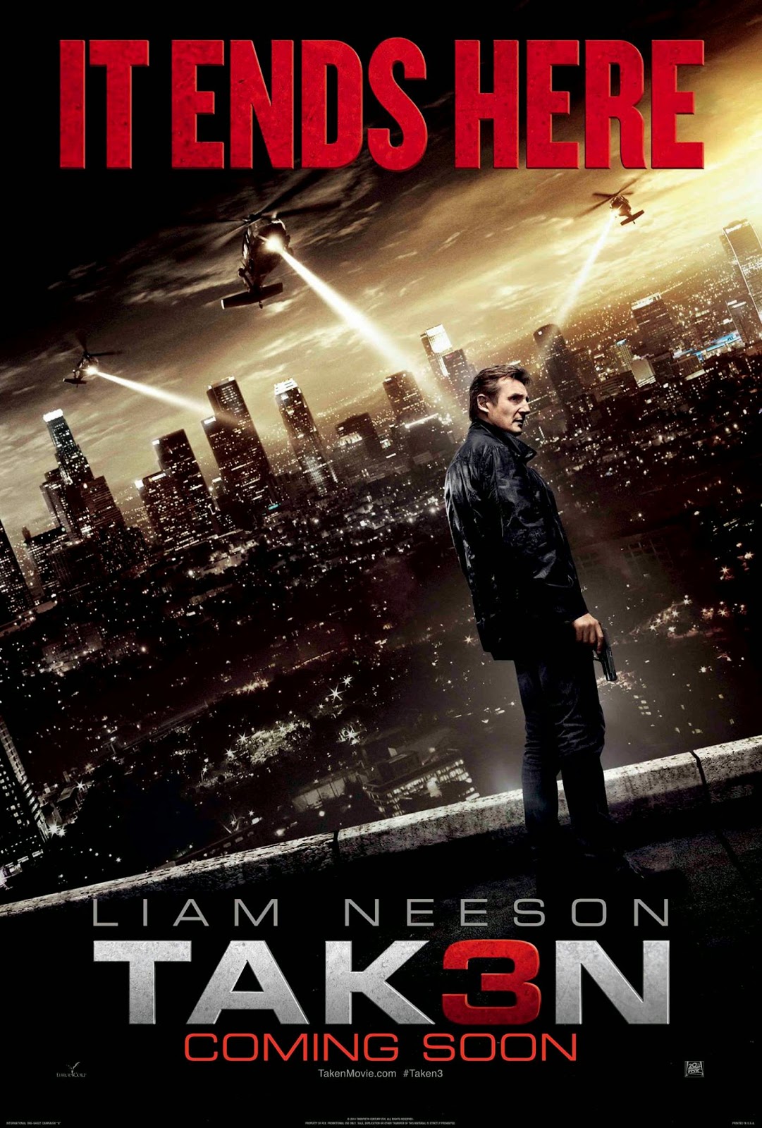
Here, the 'Taken 3' poster has used the same colours for the font and the same font type as they had in the teaser trailer, However, it doesn't have the deteriorated effect that the teaser trailer did and that's probably because the trailer was a moving picture therefore the font didn't need to be as clear because the rest of the trailer gave away what film it was and therefore the font could have some character to it, but this poster is all there is therefore the font needs to be strong and clear for audiences and readers to be able to read. Although, a similarity is that the poster also features Liam Neeson's name just like the teaser trailer did and this is to attract his fans as he is a very famous character the font of his name is quite big as well. As the poster is not a moving picture with no audio, they have used one of Liam Neeson's quotes from the film that does feature in the teaser trailer, but also because these films have been a series it could be a hint to audiences that this will be the last film in the series.


Typography and titles for a magazine cover


The title of film looks like blood being splattered across the front of the cover, and obviously it's in red which resembles the colour of blood, this implies that death or violence is featured in the film, or that a murder occurs attracting audiences that enjoy these types of films, also the colour of the title stands out compared to the rest of the dark, gloomy colours on the page, and this means it draws readers eyes towards the title which is the most important thing.
The rest of the titles on the page are made to match the title that names the film, for example the 'GREATEST MOVIE ART EVER' is in the same font (blood splattered) and colour, and the rest of the titles have red incorporated into them.
Also, having the name of the film in the largest font also helps to catch the readers eyes, compared to smaller subtitles that are in white that are of less importance because they are just naming other articles that are inside the magazine, which the reader will find out oncve they purchase and read the magazine, however these articles will link to the main feature (the film), for example there are a list of other films that have also been reviewed inside the magazine.

Thursday 21 August 2014

Research: Concept board


For my concept board, I knew the running theme for it would be dark and gritty, hence why the majority of the concept board is black this is to create suspension, although I do have a bit of red among my concept board to represent danger and murder, this is also the theme of colours that I will be using for my ancillary products, the darkness for the pictures used in those products and then red to stand out, as this is a typical convention used for many magazine covers and film posters that are featuring Thriller films.
Also, close-ups are another important convention to include in my teaser trailer.
And then, secrets and family are what my story and plot revolves around to create the enigma for all three of my products. 
As well as all of this, I will be including things like a gun, mystery and crime-solving, and suits because these are some of the typical props and events that happen within Thrillers, also because my target audience is males between the ages of 15-30 and these are things that they will be interested in seeing.

Wednesday 20 August 2014

Research: Location shots

Locations for the Thriller genre need to be more realistic areas that the audience can relate to as Thriller's are mainly more realistic than other films such as Action genres.

St Mary's and Margaret's Church
Here, I filmed the scenes for the funeral where the two brother's are looking at their mother and father's grave, I chose this obviously because it is a graveyard, but also because it is a more realistic setting of graveyard instead of ones that you see in Horror films where they've gone out of their way to make the graveyard look spooky and terrifying, whereas I was going for a more sad, dull, and gritty look. This is also the scene where we see the mystery woman in the background and the location amplifies this because the graveyard already adds tension with it being so eerily quiet and empty, and now its creating suspension and mystery by adding this unknown woman.

Britannia Rd
I chose this area for the fight scenes because even though it is quite a public area, I chose to film a bit further deeper into the fields away from everyone which gave it more of a desolate feel. I wanted this because the reason why they end up here is because they are tracking the killer of their parents and then they become suspicious of one another, and being in a desolate area makes it easier for them to blame one another, also because it gives them a hopeless feeling and they become so desperate to find the answer that they end up turning on one another.

Blue Boar Ln
For the final location, I wanted it in a more residential area, this is where I have filmed them running with a hand-held/tracking shot, and this is really where the tension and gripping of seats starts to kick in, this location helps because when it is set in a more residential area then the more threat there is and likelihood of someone getting hurt which builds the tension, also because of the houses everywhere, it's very easy to feel trapped or as if something is looming over you.

Update
Britannia Rd. will no longer be used as a location for my teaser trailer as I will be removing the shot that was filmed there entirely from my teaser trailer as I no longer want it and will be replacing it with a shot filmed in my house in a study room.
Here, is a picture of the new location I will be using in my teaser trailer.
PICTURE OF STUDY AREA

All other locations will remain the same.

Tuesday 19 August 2014

Research: The typical conventions of a thriller teaser trailer

For this piece of research I'm going to be doing both primary and secondary research, I have chosen to do both types of research so that I get both a professional advice from finding up the typical conventions online, and I also get an audience perspective of what they expect to see in a teaser trailer/film to be able to identify the sub-genres.

I have made a questionnaire on survey monkey, asking questions about what typical things I should include in my teaser trailer and also if the ideas I already have are conventional or unconventional.
Here, is my questionnaire ------->> https://www.surveymonkey.com/s/BMKBM7D


I have printed off 10 questionnaires to give friends and family who would be my target audience to fill out so that I can get a better understanding of what I should be including in my teaser trailer to meet the conventions of a action/crime.
Below I'm going to list the seven questions that were on the questionnaire and what the majority answer was:
1. Do you think location is an important feature for an action/crime film?
Yes
2. If Yes, what sort of location do you think it should be set in?
Most people said a dark setting to create an atmosphere, one person said somewhere relevant to the plot, and another chose a busy city centre.
3. Do you think it's unconventional if I don't feature the villain in my teaser trailer often?
No
4. What type of outfit do you think the two brothers should be wearing?
Suits/Casual
5. Do you think weapons are a necessity to be seen in the teaser trailer?
It was an equal split between yes and no.
6. Do you think fast-paced and tense music is a good choice for an action/crime teaser trailer?
Yes
7. If No, what sort of music do you think would be better suited?
There were no answers for this question as everyone answered yes for the one above.

When I done my secondary research on the typical conventions, they used The Dark Knight as an example which is the example I used when I was pitching my original ideas for brief 2. The blog post I found on this mentioned how obviously the villain and the hero are both needed as main characters for both of these sub-genres, and most often the crime involved the villains steeling something valuable or being threatening to innocent people, location is an important convention in these two sub-genres and usually they're set in big cities where there are lots of people and lots of money because it's more of a threat then, one of the mise-en-scenes are guns because in crime weapons are usually the main source of a crime, also the villains are most often dressed in dark clothes because then it's easier for the audience to identify who the villains are. For camera angles there are a lot of close-ups to show the characters emotions and reactions to things, and also long shots to show the location of where they are, body language is also important if they are quite open then it shows that they are calm and feel in control, however if they are fidgeting then it shows they're nervous or anxious, the type of music used is most often fast-paced to create the suspense and engages the audience into the film. You can look at the blog post I looked at for my secondary research on typical codes and conventions here.

Monday 18 August 2014

Research: Ideas for mise-en-scene/props/costume/cast

From the questionnaire that I got people to fill out and answer I found out that there was a mixture of answers for the question about what the two brothers should wear, and it was a mix between suits and casual wear, so I decided to have the best of both worlds.
For the shot of the brothers at their parents funeral, I've decided to have them wearing suits:
Carl's suit

Alex's suit
(Carl and Alex are my two brothers who have agreed to play the two brothers in the teaser trailer)

Alex's casual wear
And for the shots where they're running down the street and having a fight I would like them to be in casual clothes as they are just two normal men:
Carl's casual wear


I am going to act as the sister they don't know about in the one scene that she is featured in, however I am aware that the sister is suppose to be a couple of years older than her two brothers so I'm hoping my outfit and some makeup will help me achieve that look, if not then I will find someone else to film for that scene that looks the part.
Me in my outfit
Finally, the very first scene is of the parents feet walking up the driveway towards their house so I decided to include a picture of what shoes they would both be wearing:
Dad's shoes
Mum's shoes


Update
When I originally took these photos and planned these outfits it was September/October, however by the time I organised getting a film camera and a time to film for my teaser trailer it was the Christmas holidays which means the weather had changed dramatically and had gotten much colder; I only had to change my leather jacket to a winter coat thankfully so my outfit remained the same really, however my brothers changed both outfits:
Alex's new suit
Carl's new suit
Carl's new casual wear
Alex's new casual wear
Set Design: Majority of my sets and locations are outside because this triller is full of action, also I have some locations set in a residential area of a city where there will be lots of people to increase the danger - a common feature for thrillers.


And then the rest of my locations for example when they fight was set in a remote area to create more suspense.


Lighting:

  • I wish to have the lighting fairly dark to create an atmosphere (suspense) and also to present the emotions of the actors that they are distraught but also angered. 
  • I found a website that describes the different types of lighting formally used in the Thriller genre (click this link here)
  • I have used the Back Lighting technique in the scenes at the graveyard; the sun is behind the actors and also quite low, this creates a shadow across their faces and they appear darker, this highlights the gloom that they are feeling.
  • In the scene of the parents walking towards their house I used Top Lighting by filming this scene at dusk so that the audience while watching are focused on what they are doing but not to glamorise what they are doing, I have also slowed the scene down so with the speed and the lighting it creates an emotional effect as they walk towards their deaths.


Composition: In my teaser trailer the two main characters (my brothers) are constantly the main feature in each scene and even when a third person is in the shot (me), they are positioned at the back of the shot while the two brothers are positioned at the front to portray their importance.

Update
I have decided last minute that I will be adding a prop to my teaser trailer, a gun (a fake be-be gun that my grandad owns, and will not even have any of the fake plastic be-be bullets loaded inside of it). This will be used just for one shot in the teaser trailer and will hardly even be seen. Also, I will not need to worry about members of public being concerned about the sighting of a fake gun because I will be filming this shot in near dark in a secluded area which will not be disrupting any other members of public.

Saturday 16 August 2014

Research: My target audience


IMG 2068[1] from Emily Smith on Vimeo.


Update:
After, re-watching the video above I have realised that my original target audience was too broad and vague, therefore it would be difficult to discuss what would be more appropriate for my original target audience, therefore I have changed the age certificate for my production to a 15, and my new ideal target audience is males between the ages of 15 and 30. They are considered to be 'Impressionable Socialites' according to Pete Buckingham. This is because after further research and discussion with my media class, the majority of Thriller's are 15's and above, and because of the mystery and suspension it is more ideal for men, and even more so because the main character's for my production are men.
Here, I am linking to the 'BBFC' page about a 15 certificate, what is is and what it includes.

Thursday 14 August 2014

Research: Evidence of comparative research

The genre of my teaser trailer is Thriller, because after much deliberation, action/crime/drama are three aspects that come into a Thriller and it would be easier to meet the conventions of this genre as it is a developed genre. In this post I am going to be looking at other Thriller films and compare them to other Thriller hybrids.

Crime Thriller
This is one of the most common hybrids, as the often overlap one another. However, if you break it down a crime is a specific crime or set of crimes, where the detectives have to solve the mystery, there is drama throughout and a little bit of violence. Whereas, thrillers are mainly fiction-based which are fast-paced to create suspense, but a crime happens at a more leisurely pace and are realistic. In crime films the villain is usually a gangster who commits crimes, and the hero is a police officer, in thriller films on the other hand, the villain and heroes are most often anyone; this makes crime films more relatable and realistic, whereas with thrillers the audience are able to remind themselves that it is just fiction because it is very unrealistic to happen like this in the real world and is just there to create suspension. Therefore, crime thrillers are a mixture of a few of these features from both genres.


Crime Thriller's are most often filmed in big cities as their are lots of people there which causes suspense because many people can be threatened or harmed; for example, The Dark Knight is mainly filmed in Chicago.
From being a viewer of the film I know myself that The Dark Knight follows the conventions of the thriller genre, however the teaser trailer contradicts these conventions because teaser trailers for thrillers usually includes dramatic music, and clips of people running and explosions with minimal speech, but with The Dark Knights teaser trailer they have the symbolic bat symbol deteriorating with Bruce Wayne, Alfred the Butler, and the Joker talking over top; this just gives an idea of the story for The Dark Knight and a feel for what the main characters will be like.

I chose two of The Dark Knight posters which are more character posters; one of them being the villain 'The Joker' and  the other one being the hero 'Batman'. I feel that these posters are quite dark and reflect the feel of the film when watching it, these posters suggest that this is not a film for young children or anyone below the age of the age certification which is a 12A, however even though the film and these posters are dark, a child below the age of 12 is able to see the film as long as they are accompanied by an adult; this is the cinema and film exhibitors way of making more money out of the film because more people will be able to see it as long as someone above the age of 18 takes them. These posters also include iconic features from the film and the trailer that the audience will easily be able to identify; the catchphrase from the Joker "Why so serious?" which many people from the target audience will repeat to others and this then becomes a word-of-mouth advertisement, also the Joker's smile which has be incorporated into both of these posters as it is an iconic feature of the Joker that people can identify as him.
Thriller's always have plenty of violence and blood in them, and blood is seen in both of these posters, and you are drawn to look at it; for example, in the first poster all the colour's are rather dull and dark meaning the red writing of blood stands out, and this is the same in the second poster. This is a big convention for thriller posters, for the main colour's to be dark and have red included into it as a symbol of blood and violence.

For magazine covers that have crime thriller characters on them, majority of the time the hero features on the cover solo, and the covers are ones that are associated with crime and the character; for example, Batman is in black and then supporting colour's of the text and the background are dark, such as black, grey and white.
The hero takes up nearly the whole of the front cover, to portray that his character is important, and grand. He's wearing his full costume so that it is easy to identify who he is to readers, because they know him mainly as Batman instead of Bruce Wayne, if it was Christian Bale in a suit on the front cover then readers may not know it is an article about The Dark Knight whereas with the costume reader's know as soon as they look at it. His facial expression is serious, representing that he is in a serious and dark film, not a comedy or a romance.
                                                                                                 

Psychological Thriller
A fictional thriller which emphasises the unstable mental state of the characters. It has Gothic and detective qualities with a sense of hyper-reality, moral ambiguity and complex, estranged relationships with obsessive characters. They incorporate elements of mystery, drama, action and psychological horror.


I made these annotations on the Shutter Island Poster


Having the main location of the film in the background represents it's dark, psychological horror; and similar to the crime thrillers it uses dull colours so that the colour red stands out on it and this symbolises blood, portraying that a tragedy happens in this film. The caption "INSIDE MARTY's MADHOUSE" again reminds readers that it is a psychological thriller and revolves around character's mental states. Leonardo's attire lets the reader know that he is most likely a police officer or detective from the 50's, however his facial expression/looking down, the fact he is holding a gun and the way he is standing looks like he is standing over something, this makes readers question whether he is guilty or whether there is more to him than just a police officer.

Spy Thriller


The spy thriller genre, most often the protagonist is generally a government agent or in this film's case an ex-agent who need to take violent action against a rival government or (most recently) terrorists. This genre usually fuses the action and science fiction genres.

Again, this poster uses dark colours with the title of the film in blood red to draw the audience's eyes towards it, this also informs the audience that it is a serious film with violence in it. 
Th positioning of the actor; to have him running portrays that action will be featured in this film and creates the link to him being a government agent.
Also, that he is holding a gun again highlights the government agent and action qualities of the film.

Wednesday 13 August 2014

Research: Initial pitch for Brief 2

This is our second presentation of A2 media, it is an initial pitch of ideas for the final production (teaser trailer) and ancillary products (magazine cover and posters). These ideas are not majorly detailed, just briefly set out, as when I focus on each part of Brief 2 I will go into more detail for each one, especially as I will have thought about it a bit more as I get more into it and as soon as I have planned my plot and script more ideas will come to me.

Here, is my initial pitch:

Monday 11 August 2014

Research: Feedback on the introduction task

Before the summer holidays we were to make a presentation showing the intertwining links throughout media over one subject genre. I chose to do mine on 'The Fault In Our Stars' and the media links I chose were teaser trailer, posters and magazine covers.

Here is the feedback I got from my teacher Miss Humpleby and my class:

A lot of the feedback was positive, the constructive criticism that I was given was to add more visuals to my presentation, and consider breaking up the text I had written on each slide of the presentation into smaller chunks as there was too much on each slide for the audience read, meaning they weren't able to read through it all before I had moved on to the slide.