Tuesday, 10 March 2015

Editing: Creating my second poster

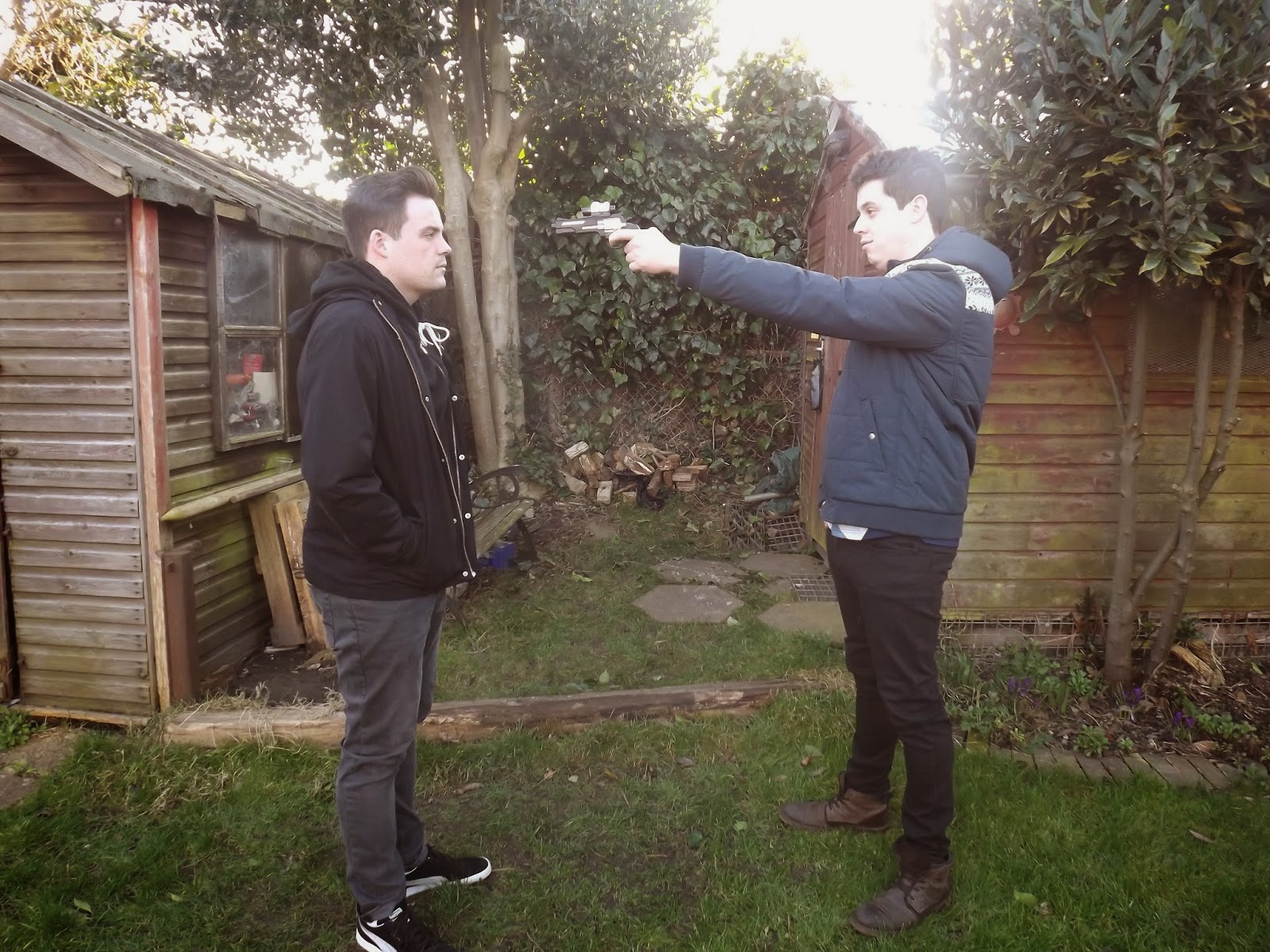
Before

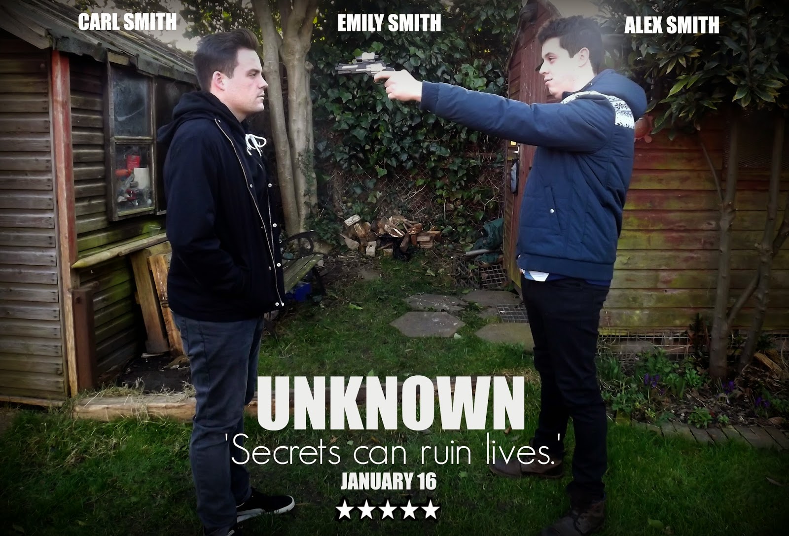
After
This photo was taken from one of the clips that feature in the teaser trailer, however I staged it again and chose to take it from a different angle, so that the two main character's were both equal in the photo and both the main focus, and this was also created on PicMonkey. There was a lot of work to be done to this photo before it was exactly how I wanted it. First of all, I cropped the picture slightly to make the boys more of the attraction and eye-catching feature on the poster, then I needed to 'Sharpen' the focus of the picture, and also make it darker as it is a dark scene that has been photographed; to do this, again I used the 'Dark Edges' effect, to draw in the focus on the characters, and then I used the 'Black and White' effect and faded it quite a lot until it was to the point of where I wanted it. After this I chose to star adding the text to the poster, and again I used the same, simple texts that I used for my other portrait picture, also using the quote from the teaser trailer again as this would link the two posters together, as well as linking them both to the teaser trailer; also adding the quote to both posters adds enigma, making the audience question what the secret is. In this one however, I chose to add the date that the film comes out on, and the name of all three main actors that feature in the film, as this is a larger poster that will feature in more places.

For this poster, not only will it feature on the billboards as it is landscape with the two hero's on the front, but on the front of my magazine cover I am also going to have a piece of text mentioning that there is a poster inside the film magazine of my film 'Unknown' and it will be this poster, again linking my two ancillary products together.

Editing: Getting one of my posters done

Before
After


I created this on PicMonkey. Here is the development of my film poster from start to finish. As I play the villain in the film, then I decided to have a black background, and once I started editing the picture the first thing I done was change the brightness on the picture and make it darker, I feel this would reflect the dark side of my character. And then, to make the darkness of my character blend into the background of the picture I used the 'Darker Edges' effect to bring the edges in together an towards my  portrait, almost creating this sort of black fog around me that I blended into. After this, I noticed how yellow my face and hand looked which looked slightly out of place against such a dark background, therefore I added the 'Black and White' effect over top as well, but faded it out a bit so that my face was whiter and more of a normal, natural colour. Now, I just needed to add text over top as there was nothing I needed to crop out of the picture, I chose pretty simple fonts so that they would not take away too much of the attention from the main picture, and white was just a colour that would be clear to read and matched well with the overall look.

I have made this poster because from the answers I got from my survey for my ancillary products said that the most likely places that my target audience would see my film posters would be on bustops and billboards, well these are two completely different places and one poster would not fit on both, therefore I took this portrait picture to go on the bus stops, also I feel that having me in the teaser poster will create a sort of enigma as the audience do not see me in the teaser trailer much and therefore creates a mystery, which is a key convention for thrillers, thus making the audience want to go and watch the film in the cinema.

Planning: Outfit for one of my film posters

Whereas for all of my other ancillary products they just wore the same outfits as they wore in the film as they were just staged pictures from scenes of the film, in one of the film posters that features me, I have chosen an outfit carefully; I have done this because I got inspiration from looking at the 'Public Enemies' film poster and also, because in the teaser trailer you do not really see my character's outfit.
My film poster outfit

My film poster inspiration
In the 'Public Enemies' poster, Johnny Depp is wearing quite dull colours such as black and grey, therefore I have chosen dull colours like that as well, considering mine is a very close-up picture as well I have made sure to wear my hair down as it is quite dark anyway and creates a dark shadow round my face. Johnny Depp's outfit also fits the conventions of the time 'Public Enemies' is set in, and I have made sure that mine does as well by sticking to a fairly modern outfit as it is a modern film, but also an average outfit as I am playing an ordinary person of no high status.

Saturday, 7 March 2015

Editing: Adding articles to my magazine cover


Now, I have decided to add articles that link to the main feature on the front of the magazine, so for example my teaser trailer is of the Thriller genre, and I have added an article about all the top thriller films from 2015 (I still have one more to add to this yet), I have decided to make them link to the main feature as after I done some research into magazine covers, one of the main things that I discovered was that the majority of the smaller articles linked to the main one.
Also, another feature that I'm going to include on the front of the magazine that will link to the main production and my other ancillary product (film poster) is I'm going to have a piece of text saying that there is a poster in side on a certain page of my film 'Unknown' and it is going to be the same as one of the posters that I am going to make.

Update


I have finished off the snippet of the top thriller film article, and I have also now added a bar code to the bottom left-hand corner.
Next, I will be wanting to take the pictures of Carl from the same mid-close up angle that I took of Alex, and then adding him to the front of the magazine cover as well, and after that I shall add more text.

Wednesday, 4 March 2015

Editing: Making my magazine follow the conventions of Empire Magazine

Making it more realistic
After looking at the Public Enemies edition of 'Empire' magazine, I realised that even though I had chosen a similar font to the 'Empire' font, and in the same iconic colour of red. However, I hadn't stretched the title across the entire front of the top of the magazine, I'd just left it to the left-hand side, therefore I changed that. And, in every single edition, whatever the main focus of the magazine is, so in my case the two brothers, they overlap the title of the magazine, and are brought to the front in front of everything, as they are the main attraction of the magazine, therefore I made the picture of Alex larger and over top of the magazine title slightly, also I erased his edges a bit more to make him look cleaner and neater.

Looking at other editions in closer detail, every edition has the 'Empire' website somewhere beneath or above the magazine title, therefore I added this in, I wanted it slightly more bolder than it would be allowed, however it would not allow me to do this because of the font type chosen, therefore I may try another. Also, I have started adding my articles in that will link to my film in some way, for example; the article I've started making above is going to feature the 'Top Thriller films for 2015' and this links to my genre of film.

Editing: Starting off my magazine cover

Inspiration for my magazine cover
As my chosen film magazine to feature my magazine cover is 'Empire' I felt it was best to keep an already made one by my side so that I could go back to it to see what features the real 'Empire' magazine has, and then I could add those to my own.
What I've done so far
So far, in my first sitting with creating this magazine cover, I have added the background picture and then overlayed a picture of one of the brothers, making sure to erase all of the background that was behind Alex in his photo, I also added the title of the magazine as well. For my first time with playing around on PicMonkey I feel this went pretty well.

Editing: Teaching myself how to use PicMonkey